It was a productive day at school today. We have finished the “Botanica”-themed project (well, the teaching is over but I’ve still got a lot of work to complete!) and started a new “Graphica”-themed project.
We began by ‘applying techniques to drawings.’ Limbering up with some quick charcoal, pastel and conte exercises to re-acquaint ourselves with the media, we began the session drawing an animal. I had an inspired moment before class this morning and grabbed the basket of animals that Louis played with when he was about six or seven. The class had an array of lions and tigers and bears (oh no!); meerkats and warthogs and goats (oh no!); frogs and impala and geese (oh yes!) to choose from.
Almost finished the radiant poppy. Not so much an exercise in copying, but in mixing and playing with gouache. Whaddyareckon, Mum? Might get you to take a better photograph of my image. I think it’s blurry.
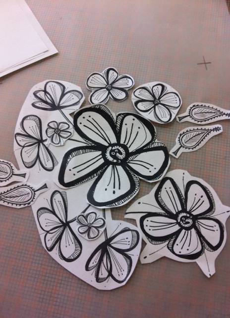
Arranging the motifsArranging the block pattern into a half-drop repeatColouring it up with some gouache
Learning how to create repeat patterns was great fun, but had I fully understood that the silly little motifs I created in a hurry and under pressure one Wednesday night were the silly little motifs I was to use for this exercise the following Wednesday night, I would have … um, probably still created silly little motifs like these.
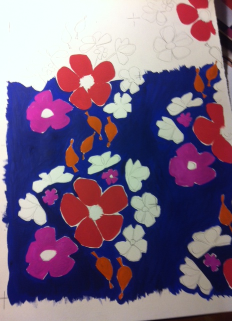
Nevertheless, I think the black lines of these flowers have merit and I would like to experiment more with this look, particularly with trying different colours and medium.
I thought I’d be clever and give this design the colourway treatment, but later found out I got that wrong! A proper colourway would mean a second design using different colours, perhaps green and brown, not the same colours in different positions.
I should also have created colour chips when I began painting, as I couldn’t replicate the blue when I was finishing off the background at home. Joey said that the thick blue paint created a river effect, and the flowers were floating in it (the darling boy!)
Adding more gouache…..and more gouache and some black textaNearly finishedTrying some other weird colours (this time with pencils)
My mother is a photographer and has recently moved her lens from the expanse of the Australian landscape to the intricacies of flowers. How convenient – an on-line image-bank of Botanica at my disposal. Than ks Mum!
Mum’s birthday card to me this year was a print of one of my favorites from her collection – the Radiant Poppy. I decided to use this print for an exercise in using gouache to tint and tone. Can I replicate the almost tissue-like petals and the hundred-and-one stamens?
It’s a work in progress – I’ll let Mum be the judge!
The Radiant Poppy, by Bette DevineMy first layer of gouache. I’m pretty happy with it.The second layer of gouache. I’m falling out of love with it, but I have a long way to go before it is finished.
What fun! Creating a mixed-media collage using crayon, wax candles, ink and whatever else takes my fancy. “Collage is limited only by the artist’s creativity,” says Libby. One night at Margot’s as we drank bubbles, I scribbled on a pad using a candle, oil pastels and out-of-date food coloring. The dried pieces smelt like stale tumeric – the result? Not ‘fumage'(lol), but several pieces that I think are so wonderful I’m loathe to cut them up for use in my final collage (x 2). This is just a sample of the textures and tones I made:
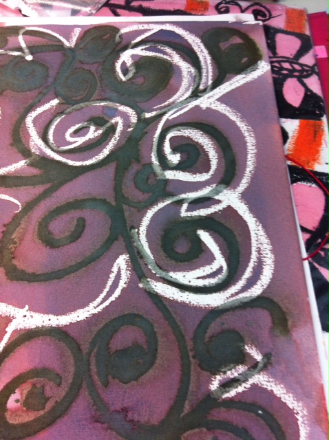
Do you see my new gravatar? It’s a gouache and ink pattern I made using the ‘resist’ technique – and I’ve decided that I can’t resist it! I love using gouache. It goes on all creamy and smooth. To create a masterpiece using the resist technique, you first need to paint one thick layer of gouache followed by another over the top when it is dry. Then paint ink over the top, wait for it to dry, wash off under the tap and voila! We used fabriano paper – I’m not sure if it works with other papers. I will have to experiment. Late last night I was doing some more experimenting and came up with the below design. I learned two things: 1. gouache on gouache doesn’t work – the second (top) layer won’t remain after the ink is slathered over, and 2. it pays to be exacting with the line work. Some of the edges lose their definition if the second layer isn’t exact. The gouache designGouache and ink resistGouache and ink resist #1
It all began at the orientation session, which was an introduction to our Botanical-themed project “Botanica”. We are to work in groups and brainstorm a theme and colour palette. Our homework – collect images in readiness for a group concept board.
First exercise – create a group concept board. My group is made up of the random bodies I was sitting with: Craig, Hanna, Lucy and Darcy.
Craig brought swatches of Indian fabrics and some Moreton Bay fig leaves and fruit. Lucy brought Indian decoupage ornaments with fine floral designs and some floral fabrics from home. Darcy brought a book of Indian textiles. I can’t remember what Hanna brought. I think it was fabric. I had printed out some photocopies of floral images I had taken photographs of with my iPhone – scarves and cushions and fabrics I’d seen at my local shops on the weekend. I’d also taken some close-ups of cacti from home. And images from Mum’s amazing collection of flower images
We discussed what we had brought and why we had chosen it. I like strong colours. Craig likes block patterns. Darcy had enrolled later than us so grabbed a book at the library before class. Hanna had travelled extensively to various middle eastern countries. Lucy suggested we pick a theme we weren’t comfortable with – to test and challenge us. Darcy thought that wasn’t a good idea, particularly if the theme went on for some time. So we worked on choosing a theme, and it came surprisingly quickly!
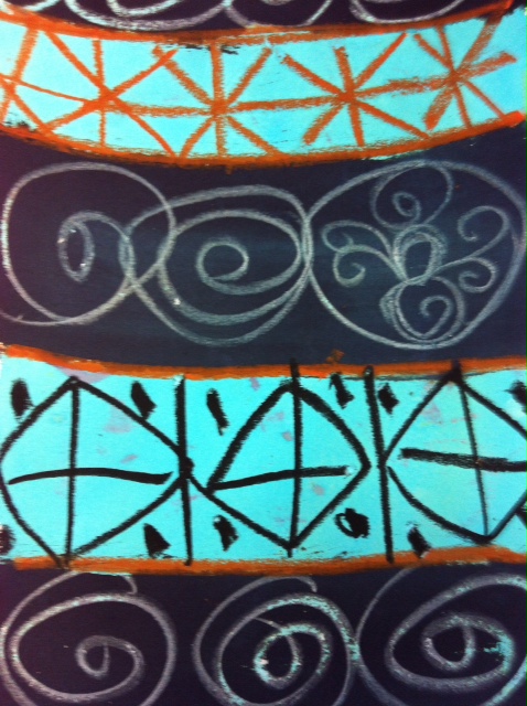
My desire for using strong colours married perfectly with Hanna’s love of eastern cultures – she described the black clothes of the women in the desert, and how when the winds blew, the fabric of their burqas would shift to reveal bright and exotic colours underneath. We saw pinks and oranges and ochres (and maybe turquoise and black.) We got excited by the idea of Persian motifs – or motifs from Iran, India, Turkey, Morocco. Other words we bantered around to inform our theme included “Islam/ic, Mecca, Orientalism, exotic, arches, doorways, mosque, repetitive, geometric, Arabic script, colour gradation, inlay tiles, hot, desert, dusty, mirage, shimmer, oasis, palm. And colours: (burnt) orange, (hot) pink, magenta, ochre, black, turmeric, gold.”
Our group homework was to look for images of Persian floral motifs, which we should bring to our next session.
Tonight we learnt how to use gouache paint. Gorgeous and creamy but a little scary. Continuing on with botanical motif theme, we were to choose a flower – preferably a real one from from the fake supply, and use one colour to paint and fill in its shape. Then, use the tiniest bit of black to add darker tones and white to add highlights (tinting). The result was a monochromatic gouache tonal rendering of average quality!
I’ve enrolled in the Cert IV Textile Design course at RMIT. My sister completed the course over seven years and I was always admiring of the designs that she created and the fun that she had.
But what was I thinking? Am I mad? I have a full-time job, two teenagers and, to top it off, an auto-immune disease. Of course I have time to attend two x three-hour classes a week plus a Saturday once a month. Lucky I have a partner who keeps the clothes washed, the floor vacuumed and the four of us fed.
It’s week 3 and already the homework is piling up. It seems that we no sooner arrive at class, set up to discuss our topic and prepare for the activity that we must start cleaning up. What we don’t finish in class we must finish at home, on top of the homework.
I told Jodie last week that I think I was over-thinking the course. It’s a TAFE course, not a post-graduate at university. It’s geared towards kids with little education and older people with a lot more. It’s assessment is flexible and I should really just calm down. But the reality is that the course is very stimulating and I want to be totally immersed in it. Bugger this working for a living caper. So much of my day is wasted by having to go into the office!!
So here I am again. Back on the blog writing a post at 11.30 at night. But not, this time, because it is a course requirement, but because I am procrastinating. Prevaricating. Prolonging the pain and protracting out the inevitable: that I must write my final assignment for this course. It is due next Tuesday and I am only a quarter of the way in!


")